Friday, November 17, 2017

Unmasking the VooDoo: Trends

When discussing technical analysis and trends, the erudite snoots among us, which unfortunately can include me, like to talk about physics. Objects, or trends, in motion will stay in motion unless acted upon by an outside force. That's inertia and yes, markets have it. How else do we explain momentum stocks, let alone bubbles?

As the old Faberge Organics shampoo (with wheat germ oil and honey) commercial used to say, "If you tell two friends, then they'll tell two friends, and so on and so on and so on." The same goes for the markets. It's the ultimate expression of keeping up withe the Joneses. Everyone covets everyone else's profit-making assets

Trends exist because investor B wants in on the action of investor A. But why?

My reasoning is that trends exist because information flows around the market imperfectly. Some people get it sooner and others later. Some people act aggressively and some not at all. Eventually, everyone assimilates the information but guess what, the market is already way up by then. But that's another topic.

If not for this fact, stocks would only trade the bid-ask spread until the next news or earnings report. They would then jump or fall, in one fell swoop, to the next price level where they would trade around the new bid-ask. It is the imperfect flow of information, either lagging or leading when someone figures out the news before it is releases, that allows smooth trending.

Nowhere but in the financial and commodity markets do people want to buy more as the price goes higher. My economics 1a professor, Barney "guns and butter" Schwalberg would not approve. Yet, in the markets, the more people that want it, the higher the demand and higher the price, and (drum roll) the more other people want it.

Talk about FOMO!

With that said, there is still a bit of sanity left here. If prices rise too fast - and that is clearly subjective - then some people wake up and realize they should probably cash some of this windfall in. Supply increases and sure enough price action heads a bit lower.

This could happen a few times and the market establishes a sustainable trend with a velocity that makes sense for that market at that particular time in history.

Right now, Bitcoin merits an insanely steep trend. It's new and, as far as a concept can be, really shiny. Maybe next year, when $30 million simply vanishes as it did just this month in competing crypto-currency ethereum, we'll see the market's invisible hand show itself. 
Here is the headline "A coding error led to $30 million in ethereum being stolen." That is absolutely frightening, but I digress, as I always do.
The real question for most markets most of the time is what do you do with trends. The answer is, "ride them."

The next question is how you tell when they end. The answer is, "the market will tell you."

Huh? So they will ring a bell at the top? or the bottom?

Well, not exactly. It is durn near impossible (yeah, I speak hillbilly) to know when the peak or bottom in any market is happening as it happens. Chances are you will have to give up a bit before the signal becomes somewhat clear. But that's the whole point of stops. They let you ride the trend until it changes.

Now, you may have other constraints such as scaling out of a position after X% and Y% moves. Or maybe you see better opportunities in other markets in trends that are not quite so old. Or your funnymentals change. Whatever your reason, you decide to get out. But that does not mean the trend is over. Only the market knows that.

The old saw, "the trend is your friend" is absolutely, positively true. However, you cannot forget about the second part of that, "until the end."  How may people go broke NOT realizing the trend changed and they continue to BFTD? Can you say Internet bust?

Bonus thought: We usually like to lambast the little guy for being in the wrong place at the wrong time. It is the crux of COT (commitments of traders) analysis saying that when the little speculator gets massively long the bullish trend is about to end.

The thing is that the little guy is right during the meat of the trend. Elliott Wavers cleverly call that "wave 3." They may be slow at the start of the trend and overly enthused at the end but the middle of the trend needs the masses to really get going with size and power.

So, you still have to know a little bit about the trend you are in. Identifying that is more than half the battle when you make your buy, sell or hold decisions. Everything else is gravy.

Wednesday, October 25, 2017

Unmasking the VooDoo: Chart Patterns

If you are not a charting aficionado you might think that trying to predict future price movements from past price movements is pure folly. And guess what? You would be right.

What? Did I just say that? Well, yes I did but there is more to it than the simple answer. We cannot predict price movements but we can assign porbabilities to what might happen based on what already happened.

"What's the difference?" you ask.

It's a big difference. If you say you can predict what will happen you are gazing into an orbuculum. That's a crystal ball, for you lay folk.

What technical analysts do is gauge future possibilities based on the footprints the elephants leave in the butter. Here is the phrase that pays:

People tend to act in a similar manner when faced with similar situations.

Chart patterns are those similar situations. The "forecast" is the similar manner of action. Nowhere does it say "will" or "must." 

Let me pull a large quote from my favorite author with that phrase embedded.

"Chart patterns are formed by the buying and selling actions of people and people tend to act in a similar manner when faced with similar situations. Some blame this on a self-fulfilling prophecy: if enough investors believe in the significance of a chart pattern ending then they will act, and thus their actions will assure that the assumed result will occur. "

- A Beginner's Guide to Charting Financial Markets: A practical introduction to technical analysis for investors by Michael Kahn.

Wow, that guy makes sense!  Let's continue:

"But investors may not act the same way this time and the charts will tell us when that is the case quickly before losses begin to mount." 

That implies that technical analysis does not expect to be right all the time. If it did, then probabilities would be 100%.  Therefore, trying rate the efficacy of technical calls just by the success rate is a failed methodology.  I challenge you to show me the price/earnings ratio at which a buy signal will always result in profits. Or a percentage of orders or inventory that is 100% right when making a buy or sell call on a stock.

Any single technical analysis-based call can fail. However, string enough of them together with stop losses and re-evaluation at achieved price targets and the Cajun chef will ga-ron-tee a nice positive rate of return.  

What is a pattern, anyway?


Charts are just graphical representations of the tape. They show us how price changes over time and the forms they take actually do tell us a bit about what was going on in the market when they formed. Does the shape of an EKG tell the doctor about what is going on in your heart right now? And can the doctor then "predict" whether you will have heart issues in the future? 

Charts form based on the buying and selling actions of people. And, they really only have three flavors:
  1. They can be pauses for rest in an ongoing trend
  2. They can be pauses as the market decides it wants to go the other way
  3. They can be pauses when the market just has no clue which way it wants to go
Number 1 is called a continuation pattern. Number 2 is a reversal pattern. And number 3 can be a trading range or just a directionless market filled with either uncertainty or apathy.

Patterns have tops and bottoms and they are indeed called resistance and support. Typically, when prices move through one or the other the trend continues in that direction. Something happened to trigger a mood change from the rest or uncertainty of a pattern to the conviction and movement of a trend.

Fortunately, markets have inertia, just as in physics. If they are in motion (trending) they tend to stay in motion. And if they are at rest they tend to stay at rest - both until acted upon by a force.

That force can be truly from the outside, such as news, earnings and legal matters. Or it can be inside the market when sentiment changes or a related stock or index breaks out from a pattern. In either case, pattern becomes trend and it will stay that way until something makes trend turn into pattern.

How do patterns form?


I am not going to get into the nuances of all the things that happen in patterns with volume, momentum and the shapes of various patterns here. Those things give us additional clues as to which way the market can break out but they are not needed to understand just how a pattern forms.

When a pattern first starts to form, the trend hits an insurmountable speed bump. Keeping it simple with a rising trend, it pulls back, finds a new support and rallies again. But it is stopped at the top of the pattern, which now for the first time starts to actually appear. The cycle happens a few more times.

What is happening now is the bulls see a cheap price at the pattern bottom. The bears see an expensive price at the top. Both act accordingly. Nobody has enough nerve to do anything else.

In the case of a triangle or any other pattern with sloping tops of bottoms, the bulls tend to sell out earlier within the pattern. The bears tend to close shorts earlier. Uncertainty builds as neither side is willing to let the market move to their desired prices. They take action earlier and earlier.

Finally, one side finds a reason to push their agenda. For an upside breakout, the bulls no longer sell out at the pattern top. In fact, they buy more. And away we go!

Different pattern shapes are just theme and variation. It is the same dynamic going on in all of them. However, pattern shapes do give us more clues as the eventual resolution.

Conclusion


Chart patterns help us decide what to do based on subjective probabilities that the market will do something somewhat specific once the patterns are broken. The market does not do X just because it broke out. The pattern breaks because the market decided it was time to move. And it lets us know about how far it will go be the way it formed the pattern in the first place.

It is our job to read these signals and do one of the only three things we can do - buy, sell or hold. We do not know exactly where the market will go and how long it will take to get there. However, based on the signs, we will get a very good idea if we should ride that tiger with a lot of money or with a little or forget about it completely.

Nobody cares if you predicted a market target. Only your wallet cares that you made it fat.

Wednesday, October 11, 2017

Future of Capitalism

In another round of file cleaning on the old computer I found my notes taken when reading The Future of Capitalism by Lester Thurow. The book was written in 1996 and I read it in 1998.

Wikipedia - Lester Carl Thurow (May 7, 1938 – March 25, 2016) was an American political economist, former dean of the MIT Sloan School of Management.

Actually, this is kind of spooky. I made (in 2017) comments in parens places.

Surging inequality (a big political talking point)
China focus will change to India focus (not so much)
Communism had good education (don't know what this meant)
No competitor to capitalism now so it will not implode (true dat)

Economic Surface of the Earth

End of Communism (Plate 1)   (well, Cuba pushed that way a little and North Korea will if they push war)
Offers lots of cheap labor (another political talking point

Migration (plate 4) pushes unskilled workers into 1st world (ditto)

New technologies (plate 2) generates skill shift (in spades)
Need to offset this (by massive skill investment) is resisted by the elderly (plate 3)

Global economy (plate 4) forces wages down (indeed)

Without dominant power (plate 5) there is no economic locomotive. (better watch out)

Progress occurs when technology meets ideology

Inflation is extinct (true dat, too)

Japan will crack (it is number 3)
Europe is biased towards social programs so jobs will flee (Nostradamus)
Global bubbles burst together (looks like that could happen very soon)
Uncertainty breeds religious fundamentalism (its familiar in uncertain times) (O...M...G...)

Capital is human and no longer ownable

Need to spur long-term thinking and R&D - Government's only role  (we wish)

Bill Meehan in the archives

I was looking through old documents buried on my computer and found this raw text excerpts that I believe eventually made it's way into the Market Technician's Association newsletter in 2000 or 2001. It was comments about a recent MTA seminar written by Bill Meehan, whom we lost in the Towers on 9/11.
--------------------


RealMoney.com comments on the Seminar

excerpted with permission from a column written by Bill Meehan.

Voodoo, as I use it here, refers to only one of the colorful descriptors that many on Wall Street use to denigrate those who spend their waking hours devoted to the art of technical analysis. Kooks, I believe, is how academia prefers to label chart readers. However, nothing was quite so satisfying as listening to Dr. Andrew Lo of the MIT Sloan School of Management present mathematical proof at the Market Technicians Association's annual meeting that technical analysis cannot be dismissed, at least when it comes to pattern recognition, as mere voodoo practiced by kooks.

It's good to have one's belief verified by such an acclaimed professor. The work continues, especially as to why the results were so significant when looking at Nasdaq stocks and so inconclusive when looking at those traded on the New York Stock Exchange and the Amex. Perhaps readers might have some ideas after reviewing the data.

Oops! I noticed that I made a big mistake above. Having the chance to meet and spend quite a bit of time with Dick Arms, who so graciously fills in for me, was actually the highlight of the meeting for me, with all due respect for Dr. Lo and his paper. And meeting many other leaders in the field was a real thrill that alone is worth the modest cost of joining the MTA.

Passing on Wisdom

I've been a bit out of touch with the market virtually all of last week, without many of the technical tools that I rely on. Therefore, I'll relay a bit of what another presenter at the MTA meeting had to say about the current technical state of the market. In addition, I'll throw in my two cents about the Federal Reserve and some of the psychological indicators that keep me from becoming more bullish in the short term. As time allows this week, I'll also do my best to respond to readers who sent me email while I was away.

While most of the meeting's presenters were very interesting (although a few were speaking a foreign language to my mathematically challenged brain), Phil Erlanger's observations about short interest struck me as particularly important. The MTA's current president focused on adjusted short interest, a sentiment tool that he developed, which has a very strong track record. The Erlanger short interest ratios for the Dow, S&P 500 and Nasdaq Composite are all at multi-decade lows and at levels far below those generally seen at times of high market risk. The charts were startling and alone should make one pause, although relying on one technical indicator isn't wise, in my opinion.

Bill Meehan is the chief market analyst for Cantor Fitzgerald, a Manhattan-based institutional trading and research firm, and writes daily for the Cantor Morning News. He can be reached at bmeehan@thestreet.com.

Thursday, September 14, 2017

Unmasking the VooDoo: Guru Calls

I originally wrote this in August 1998 when I covered technical analysis for BridgeNews to explain what a big stock bull saw in the charts to suddenly turn him bearish. The names have NOT been changed because the call turned out to be pretty darn good.

What did that mean? 

Why a big bull turned into a big bear

This week, mega-stock bull Ralph Acampora, chief technician for Prudential Securities, did something that most people on the Street thought would never happen. He issued a sell signal. Shudders went though the masses. If this guy, who was famous for predicting Dow 7000 when the Dow was 1000s of points away and who clung to his Dow 10,000 forecast for 1998 before last week's fireworks, can turn sour on stocks, what will the itchy trigger fingers of the masses do?

Let's examine what really happened from a charting standpoint. First, Acampora follows trends and patterns in stock market prices. This makes him different from that other mega-stock bull Abby Joseph Cohen, chief market strategist for Goldman Sachs, who leans more heavily on fundamental analysis. We're not going to say here which is better nor who is right. As a column that attempts to debunk the mystery associated with the Acampora side, technical analysis, we'll just focus on what Ralph saw.

There are basically two keys to his new bearish stance -- market breadth and market trends. The former measures how many stocks are going up and how many are going down. It measures how much of each day's volume is attributable to each of these two groups. In other words, is the rising tide carrying most of the boats higher? If it's not, too many of the boats have sprung leaks.

The latter concept, trend, is subject to how the stock market is sliced and diced. There are blue chip stock indices, such as the Dow Jones Industrial average, that show the "market" fairly flat over the past few months. There are indices of big stocks, such as the S&P 100, that have been rising nicely. There are indices of small stocks, such as the Russell 2000, that peaked back in April and are down 30% already. Which one of these really is the market?

The answer is that none of them on their own fit the bill. Perhaps an unweighted index, such as the Value Line Index, which gives its approximately 1800 components an equal voice, is the answer. If it is, we've been in a bear market since April.

Acampora, as well as a whole host of technicians, saw that market breadth had deteriorated badly. More stocks were going down than up. More volume was attributable to declining issues that to rising issues. More stocks were setting new 52-week lows than 52-week highs. More S&P industry groups were lagging the S&P 500 than were leading it. This is curious in that we would expect the number above to equal the number below. The industry groups together are the S&P 500.

Again, Acampora was not alone in noticing that the small stocks were going down while the big stocks were going up. Stocks with Asian exposure, such as the technology sector, were sliding since the Asian stock meltdown last autumn. True, the tech heavy NASDAQ Composite was climbing but when we examine it more closely, we see that only four stocks account for nearly half of the index's movement. That's not the market, for sure.

The 299 point sell-off we had last week was underway well before Ralph said a word. No, comments from somebody famous did not help matters but the bottom line is that the stock market was already on shaky ground.

 
Let's now look into Acampora's new downside target -- 7400. This is 1200 points away from where we are today. First, the jargon. If a correction is defined as a 10% drop, we've already had one. A bear market takes us to a 20% drop so that's where Ralph gets his wording.

Second, how did he get his 7400 number? You can bet he didn't just pull it out of his hat. The Dow 7500 level was the arguable bottom of the July 1997 - January 1998 trading range. It served as the starting point for the rally that broke free from the range and lies at one of the key percentages to which markets often fall back during declines. For those of you so inclined, it is the 38.2% Fibonacci retracement of the rally that began in late 1994.

We cannot know today whether we will see 7400. More conservative technicians will wait to see if shorter-term technical levels are violated before moving into the bearish camp. However, the moral here is that we need to question our indicators, including our definition of the market or what our advisors are saying. Market breadth and small stocks were flashing warnings a long time before the Dow got smacked.

Acampora still looks for the magic Dow 10,000 in a few months. For long-term investors, he does not sound like such as bear after all.

Friday, September 1, 2017

Unmasking the VooDoo: Fibonacci

If you ever want to sound foolish during your next television interview on the markets, tell them that the market is approaching a Fibonacci level and will do X when it gets there.  It is sort of like doing a DIY network interview and saying the house will have four bedrooms because you are using a 32 ounce hammer.

Both the hammer and Fibonacci are tools used in their respective fields. A hammer is used in carpentry to, among other things, frame a house. A Fibonacci - usually a Fibonacci retracement - is used in investment analysis to frame the market's recent move.

Obligatory definitions

Here is the section where we have to define what Fibonacci is and we'll focus on Fibonacci retracements. If you have any interest in who Mr. Fibonacci was, feel free to fire up the Google. It is irrelevant to what we are doing here.

Mr. F's claim to fame was discovering a mathematical sequence that seems to describe a lot of geometry in the real world from how petals spiral on a flower to how stars spiral in a galaxy. And from that sequence we get the "golden ratio" or "divine proportion" which somehow describes pleasing and useful relationships in art, music, architecture and design in general.

The ratio of .618 to 1 comes from a sequence of numbers where any number is the sum of the two that preceded it. Here is it in all its glory:

0, 1, 1, 2, 3, 5, 8, 13, 21, 34, 55, 89, 144, 233, 377, 610, 987, 1597, 2584, 4181, 6765, 10946, 17711, 28657, 46368, 75025, 121393, 196418, 317811, ...

As you can see, the numbers start to get huge. Fortunately, we rarely encounter any above 144.

And even more fortunate, the ratio of any two consecutive numbers settles on .618 fairly quickly. As follows:

0, 1, 0.5, 0.666667, 0.6, 0.625, 0.615385, 0.619048, 0.617647, 0.618182, 0.617978, 0.618056, 0.618026, 0.618037, 0.618033

First, this is the ratio calculated out to the number 610 in the sequence.

Second, and more important, you can see how the ratio oscillates higher and lower as it hones in on the .618 value. Any ratio beyond what is shown above is pretty much just rounding error away from that value.

Voila! the golden ratio!

Fun for math nerds
 
The ratio has all sorts of neet-o properties. For example, 1 / .618 = 1.618.

And 1 - .618 = .382.  Guess what the square root of .382 is? That's right, .618.

.382 / .618 =  .618

You have probably seen these two percentages on the charts an they are roughly equal to the simple percentages traders have used for years, namely 1/3 and 2/3 (or .333 and .667).

Guess what is not a Fibonacci number. 50% or .5.  Check out the sequence. It is nowhere to be found. And you cannot concoct it from math-ing 0, 1, and .618, either.

Still, traders do attach meaning to a 50% retracement or pullback and it has wormed its way into analysis using Fibonacci. Don't fight it, exploit it.

Using this stuff

Now is when we get to dispense with the formalities and use the name experience chart watchers use - fibos. Don't confuse this with fibbie, which is the FBI. Or fubar, which was what you may be feeling right now trying to digest all this fibo stuff.

Fire up any charting software package and under the drawing tools section you will see Fibonacci retracements and possibly Fibonacci extensions, time and arcs. They are all just different ways to look at two points on a chart - usually a high and a low - and then draw stuff off of them at specific percentages.

Take a look at this chart of the S&P 500 from 2007 to 2011. Using the basic set of fibo retracements of 38.2%, 50% and 61.8% look how nicely we could project where support and resistance might be.


Here is where you can get into trouble. These levels are likely places to find support and resistance levels but not always. And sometimes you might be tempted to add more fibo lines until you find one that fits.

My advice is to never add more percentages except for one... and it is a bizarre one. We'll get to that later.

Remember, we are only trying to frame the market, not nail all of its turns and accelerations. We'll use other tools to attack that part.

Anyway, we can see that the rally peaked at the 61.8% retracement and the ensuing correction stopped at the 38.2% retracement. Whoopee! It worked once. We can even see the market stumble in the vicinity of the 50% level.

Let's repeat this. Fibos are likely place for turns, not guarantees.  But we can beef them up a bit by measuring fibos from other points and see if they overlap, or cluster. If they do, then we have a better support or resistance target.

Check out how the rally from the 2010 pullback low to the highs of 2011 is 161.8% of the pullback itself. Something usable must be going on here.

Even better, what if moving averages hit those fibos? Or normal horizontal support or resistance? Or trendlines?

Getting the drift? As with any tool, the more things that point to a price level the more likely that price level will be important.

Now for the bizarre.  Some people use a 78.6% retracement level. Note how this is kind of close to 75% but that is not what makes it bizarre. It .786 is the square root of .618.

In my book, if a market can retrace this much of a previous trend, it is rather likely to retrace the whole thing.

The other fibo stuff

We touched on extensions, time and arcs so let's put in the quick definitions. A fibo extension is a number bigger than one and it projects where a market can go. Look for such numbers as 1.382, 1.618, 2.618, 3.618, etc.....

Draw an arc centered on the origin for each ratio (usually the original ones less than 21) to find trend targets.

And instead of measuring price, do it on the time axis. Think about looking for a 61.8% price retracement that took 61.8% of the time of the previous trend to happen. Make a fibo box out of it.

Fibos are also used in Gann and Elliott Wave analyses. For the latter, we like to see Elliott Wave 3 to be 1.618 or 2.618 the length of Wave 1.  That is a whole nother can of worms so we'll end this right here.

Use fibos on your charts but please use other things along with them. They can help you frame the market but like a hammer, you will have to decide where to put the door and windows. Fibos do not dictate where you buy and sell.

Friday, August 25, 2017

Unmasking the VooDoo: Sentiment


Usually, when I discuss the major parts of technical analysis I'll use an analogy of a table. Price is the top of the table and the most important part. The legs are volume, time and sentiment. They support price analysis but do not supplant it.

Everyone gets price from patterns to trends to momentum. Everyone get volume. Most people get the concept of time, too, which includes such things as cycles, analogs and some esoteric stuff such as Gann.

But sentiment is often the red-headed stepchild of the analysis. Sentiment is hard to gauge. It is hard to quantify. And it is usually fairly hard to gather. Just look at your charting software list of studies. You'll see RSI and cumulative volume. You might even see an Elliott Wave "recognizer" but you are not likely to see something called sentiment.

These things do exist but they are not derived from trading as all the other parts of the table. Sentiment is the true oddball of technical analysis because it is the only analysis that seeks to figure out what traders are thinking. It's not like everyone inputs their feelings into an app on their screens and sends it off for tabulation at a vendor.

Yes, I know there are surveys that do just that but for every collector of sentiment there is a different method and interpretation.

And there are many, many different types of surveys and proprietary indices. There are surveys of traders, of investors, of newsletter writers. Then there are surveys of the actions of traders, which are different from surveys of what traders think. There are surveys of money managers and of Wall Street strategist equity allocations.

There are a few oddball things such as the trend of carpenter tool prices and railroad car usage. Most people may have heard of the trend in oil rig counts.

Have you heard of the hemline indicator? They get shorter when people feel feisty and good.

How about the magazine cover indicator? This is a real thing and it is actually pretty good.

The ratio of football revenue to baseball revenue? Football is a darker sport. Baseball seems to do well when people are happy. Just ask George Carlin what he thinks about these two.

How about horror movies vs. romantic comedies? Same logic.

Giving credit where it is due, those last two come from socionomics, which looks at social mood as an indicator of the stock market. It actually works in reverse but they are closely enough correlated for this discussion.

And if that were not enough, there are a few things that are generated from trading including the famous VIX index, which is concocted from options prices. There is the ratio of puts to calls. Of put volume to call volume. Of equity only puts and calls. Of index puts and calls.

I supposed if we go there it is not far to include the number of stocks above their 200-day averages and at new 52-week highs or lows.

Have I convinced you that sentiment is wild and whacky? And hard to quantify? And hard to even obtain the data?

Using Sentiment

Let's assume you have access to some sentiment data or perhaps just have eyes and ears to follow the news.  What do you do with it?

First of all you have to understand that sentiment is a contrary indicator. And most of the time it tells you nothing useful. If the market is going up then sentiment should be happy.

It is similar to the trend is your friend until the end. Most of the time, the crowd is actually right and you follow along. Only at the extremes is it wrong and you need to go against it. You know, buy when there is blood in the streets. Sell when E*Trade runs ads with cab drivers buying islands. Or when the local pizza shop owner brags about how many houses he flipped.

Remember way back to 2008 when the market was going to hell in a hand basket? It was a brutal bear market and the government was panicking to do something - anything - to look like they were able to stem the tide. My father-in-law, rest his soul, called me to sell everything in his portfolio. I sold a little so he would not be mad at me but I kept the rest.

When the public gets so scared that they throw in the towel you know sentiment is at an extreme for bearishness. In fact, the American Association of Individual Investors survey was at a record high for bearishness. Something like 70% vs. its historical 28% (I am just going from memory on those stats).

Take a look at what was on the cover of Time Magazine on March 9, 2009. It said the economy was holding on for dear life. it talked about foreclosures, about nationalizing banks, toxic mortgages and your disappearing savings.

Guess what day saw the absolute lowest close on the Standard & Poor's 500 index? That's right March, 9 2009. It nailed the bottom.

Usually, there is a lag in these things so don't obsess over this perfection.

Why does this work? When editors or general interest media take the pulse of their readers and finally believe that readers want to read this stuff then we know sentiment is very one sided.  You may rag on Barron's covers but Barron's is not general interest. It's covers are driven by professional sentiment, not the general public.

The same thing works at tops. Think tulip bulbs. Bitcoin. And right now, some think Amazon.com. None of these markets, save for Amazon, had any connection with the real world. They were the greater fool, burning match theory in motion. They went up because of FOMO. You didn't think I could schtup in a millennial reference, did you - fear of missing out. Go buy some etherium. YOLO.

When an actual survey goes extreme, you can bet that whatever trend was in place is nearing its end. But remember, sentiment is not a trading trigger. It sets the environment for that trigger to be really meaningful.

If you can find a stock with a reversal pattern or some other technical positive in place and sentiment is awful - like SNAP was in mid-August - it might be ripe for at least a trade if not investment. Likewise, when all the Amazon haters finally acquiesce (i.e. shut up) then we can consider the stock is too high.

Friday, August 11, 2017

Unmasking the VooDoo: Moving Averages


As with all technical indicators, moving averages are just tools chartists use to figure out what they need to do in the markets. Notice I said they are figuring out their own actions, not divining where the market is going. Of course, the two are related but that is not the point.

What is the point is that pundits and journalists like to report when the market breaks one of the more widely followed moving averages. In this edition of Unmasking I am going to take a look at what a move through an average - or a "crossover" - really means.

Let's start with just what a moving average is. If you want the full definition feel free to fire up the google, the bing or even (shudder) the yahoo. And if you know what a moving average is, feel free to skip the next two paragraphs.


A moving average, or average, is just an mean price over a certain period of time. A 50-day average is the sum of all prices - usually the close prices - divided by 50.  Easy peasy.  Since the calculation is redone fresh each period, the value window of data "moves" over time. Get it? Moving average!


Yes, we can change the span, period, input type and even the weighting of the calculation using any number of oddball formulas but again, if you want to learn about that, it's back to the google for you.

So what is the big deal with these things? Do they create trade triggers? Which ones do we use?

To answer the last two questions: maybe and whatever floats your boat. Yeah, not much help but these are answers you need to develop on your own. I'll just tell you what I do with them.

And to the first question, the big deal is that they help us see the forest for the trees. They smooth out jumpy price action to let you see the major and minor trends. You change the parameters depending on what you are trying to do.

You do realize that the government actually uses a moving average on some of its big monthly economic reports, right? Why? They say it smooths things out. Score one for the chartists.

You can use averages in pairs or even triplets, garnering insights as the averages dance around each other and with the price plot. But let's KISS (keep it simple, schmegegge).

Let's talk about the 50-day moving average. Yesterday, August 10, 2017, the S&P 500 and Nasdaq both closed below their 50-day averages for the first time since July (June for the Naz). The financial headlines were quick to point that out and with the news of the day - a potential nuke crisis in North Korea - boy did they make a big deal. Gotta build the click through count.

Chicken Little was ready to sell everything and head for the hills. Now, can we take a peak at the headline from July 6, 2017 when the S&P 500 last closed below this red line in the sand?
July 6 - Nasdaq challenges major support amid geopolitical tensions, S&P 500 nails 50-day average
In the words of  that famous portfolio manager Homer Simpson, "Doh!"

Six days later, the Spoos reached another new all-time high. Talk about a crappy sell signal!

Let's look at the charts. As you can see, price action violated the average on four separate occasions before the current event since the November pre-election low. The 50-day average did not deliver a successful sell signal one time. None. Zilch.


That does not mean that a drop below the average is always meaningless but I'd rather look for something more reliable, such as a support break, to tell me to sell. Rather, I'd use breaks of the average to set up or confirm other signals.

So again, what is the point? The point is that averages help us figure out the trend. Just look at their name - average. Let's expand the chart all the way back to the start of the major rally in early 2016.


I added the trend channel with a little technician's license to make the upper line more meaningful. That means it touches price action more times.

Look at the 50-day average. It more or less runs through the middle of the channel. Price goes above and below it yet it still was a bull market. The average itself spent most of the time rising.

The next question about that time when it was not rising naturally will be, "How do you know it will go back up?" Well, you don't but there are other tools to use, such as the popular 200-day average and any number of indicators.

The point is that in a bull market being above the average is good but being below it is not necessarily bad. In a bear market, being below is good (for the bears) but being above is not necessarily bad (for the bears).

So, slap on your averages, short-, medium- or long-term, simple, exponential or VIDYA, and find out what the current trend is. However, selling just because price dipped below your average is not always a good idea.

Tuesday, July 18, 2017

Millennial Breakdown

I've written sporadically about how the new generation (I guess I am now in senior citizen territory) cannot do simple tasks that we boomers take for granted. Where does the postage stamp go on the envelope? How do I fold the New York Times to read on the train?

I blogged a similar topic here in March 2017.
(http://quicktakespro.blogspot.com/2017/03/the-coming-crash-of-internet.html)

Remember way back when...in school you had to learn basic math even though you had that nice Texas Instruments calculator? I never got the hang of that one but my Casio with none of the fancy functions worked just fine. Who did not enter 01134 and turn it upside down so it says hEll0?

But I digress, as I always do. The point was that you needed to have some math skills to really understand what the calculator was doing. Does the answer makes sense? Did I hit + instead of -? You get the point.

You need map skills to know that blindly following google map directions can get you stuck in rush hour traffic in the heart of downtown Manhattan instead of taking a better route. I also mentioned that last March.

So, even though you do everything by email there will be the odd time when your water bill must be mailed to the utility because they do not take credit cards. You need to know where to put the stamp.

I admit to clinging to the old ways of having a little cash in my pocket and planning my travels in advance. Here is the story. My 22-year old daughter flew back to NY to spend the weekend with friends and of course visit us. She ended up at a friend's summer house in the boondocks of Northern New Jersey and needed to get herself back to us on Long Island Sunday morning. No problem, right?

She asked me for help picking a bus to NYC. How should I know? She finally figured out where the bus was but she had to get there. Did her friends wake up early to drive her? Of course not. But no problem! Uber!

Well, let's say there is not much coverage in the NJ boonies early on a Sunday morning.

Long story, short, I would have know exactly how I was getting back to the city to catch a Long Island bound train on time before I even left for Jersey. I do not expect all of my needs, whether travel or food or even sunscreen, to be waiting on demand in real time for when I summon them.

The bottom line is she waited for her friends to drive back to NYC. Oh, and they did not even drop her off at Penn Station. She had to take the subway.

Millenials are so much more sophisticated than I ever was but they are helpless in the face of any glitch. They are so much smarter than I am yet who gets the call when things go wrong?

OK, I'm done. Where's my prune juice?

And get off my lawn.


Tuesday, July 4, 2017

The Fallacy of Analogs

One of the key tenets of technical analysis is that we can use previous patterns to forecast what might happen in the future. It is not the same easy modeling of fractals  (please tell me you get the sarcasm). We cannot build the big picture from a lot of little pictures as we can with snowflakes, coast lines and galaxies. And if you think that patterns are self fulfilling prophesies, please stop reading now and navigate to Ihaveaclosedmind.com.

Patterns do not predict the future. They give us a better probability of a future outcome because people act in similar ways when faced with similar situations. You get to define what is similar.

Note the liberal use of the term "similar." Also note the term "probability."  If these things worked perfectly as expected then there would be no market.Who would take the other side of an upside pattern breakout if the probability were 100% that the market would rally? That little level of uncertainty allows bulls and bears to place their bets, manage positions and even operate in different time frames.

Now that I've established that patterns work, at least with a decent enough probability to make correct calls, let's look at two patterns together. These are called analogs and they are used to find similar behavior in the past so we can forecast what will happen in the future. Or, patterns in one market vs. another, including a commodity and stocks that gather that commodity.

Who has not found patterns in the Dow that look a lot like the one in place in 1929 just ahead of the crash? Who has not compared the tech bubble to the housing bubble? You get my drift.

Sometimes these analogs are useful (asterisk). But sometimes they look great until you realize you've stumbled upon coincidence?

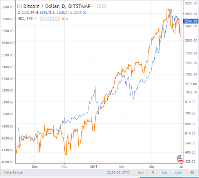
Check out this overlay of bitcoin and the Nasdaq-100 for a recent six-month period. Both markets were soaring. Super performing FANG stocks (the acronym for the go-go technology names) drove the Nasdaq-100 to dizzying heights. And bitcoin, the new crypto-currency was making different but equally as powerful waves as the next great thing. It kind of made sense that these two world changing markets looked the same.


Sure, there are a few times one zigged while the other zagged but overall they tracked each other quite nicely.  Therefore, as I write this and the tech sector is getting somewhat hammered in what the bulls hope is the long-awaited correction we can excuse bitcoin's recent weakness. When one turns up, it should signal time to buy the other, too.

Of course, this was a fairly small set of data so let's go back a but farther to see if things still look as good.


This chart shows about twice the span of the first and it is still not too bad. The July 2016 period was a big headache and January 2016 was even worse. However, nobody would argue that they two plots still looked rather similar.  Damn! We got something here!

Um, no.

Bitcoin spent all of 2014 falling while the Nadsaq-100 had another spectacular year.

In statistics, most people find a relationship using one span of data and then test that relationship using a completely independent set of data. The second set is called "out of sample" and it is important to make the case that some theory works all, or at least most, of the time. Testing on data used to create the theory is like eating your own cooking. You may like it but everyone else heads to the vomitorium.

Fun fact - Although we use it for dramatic effect, a vomitorium is not a place to puke after over indulging. It was one of a series of entrance or exit passages in an ancient Roman theater. It means "to spew forth" and they were designed to provide rapid egress for large crowds at amphitheatres and stadiums. Think about that as you head home from the ball park.

Getting back to the topic, there is no analog here. It was coincidence. You know, correlation does not imply causation. Yeah, I don't like that phrase, either.

Then why do we look at them? Perhaps for the same reason we see a man in the moon. We are programmed as humans to look for order where there might not be any. I think it is some primitive survival thing but I'll let you look that one up.

And now for the asterisk. Did you miss it? It was in the fifth paragraph and above the first chart.

Why are these analogs useful at all? My take is that they give us two charts to analyze for support, resistance, trend and pattern at the same time. Then again, you could analyze them completely separately and still find the same support, resistance, trend, pattern and eight-by-ten color glossy photographs with circles and arrows and a paragraph on the back of each one. 

Never miss a chance to quote Alice's Restaurant. 

Ending on a serious note, stocks and bonds sometimes move together and sometimes they move opposite from each other. Sometimes they compete for investor dollars and sometimes they are risk-on vs. risk-off proxies. The real challenge is knowing which condition is in place sooner rather than later. Is it an inflationary environment or deflationary? Is the economy this or the dollar that? Are we in the old economy or new? Oil or natural gas or solar? Etcetera ad nauseum.

I do not completely dismiss analogs for use in the big picture. I also would use them as I use regular chart patterns in the probability assessment task. However, thinking one market will dictate the fortunes of another is folly. Pure price analysis of the market you trade is still the best way to figure out what you are going to do. Buy, sell or hold. After you show how smart you are with equations, speeches and theorems, it all boils down to what you do. That is the whole point of any analysis.

(charts courtesy of TradingView)

Sunday, June 25, 2017

Unmasking the VooDoo - Head-and-Shoulders

Whenever I think about the famous - or infamous - head-and-shoulders pattern from the world of chart reading I always seem to go back to the late, great Mark Haines of CNBC who in the summer of 2009 asked every guest, whether they were a technical analyst or not, if they were worried about the head-and-shoulders pattern that formed in the market. I cannot remember if he was looking at the Dow or the Spoos but that is far too picky for this episode.

Anyway, what he saw was this:


It sure looked like a head-and-shoulders, which as "everyone knows" is a reversal pattern. Keep in mind the environment we were in at the time. The Internet bubble popped and the raging bear market was only three or so months in the rear-view mirror. That is, for the few who recognized that it was actually over.

Haines and countless others were still in panic mode and in extremely skeptical of any rebound. Therefore, a possible reversal pattern was looming to squash investors one more time.

I also have to give Mark credit for recognizing the pattern with it variation of a left shoulder but we'll get more into the details of the pattern a little later.

Anyway, let's see what happened after the gentlemanly freak out on television:


Oh snap! What the heck happened? The world's most recognized pattern (by non technical analysts) failed to end the rebound. And the market went up - a lot. And fast. Hokey Smokes! (Think Rocket J. Squirrel).

Let's dig into the deets, starting with what exactly a head-and-shoulders (H/S) is supposed to be.

While the pattern works in bull and bear trends, albeit it must be upside down for the latter, let's stick to everyone's favorite - the rising trend.  

As we know, as trends trend they usually exhibit a bit of ebb and flow. Advance and pullback. Three steps forward and one step back.  You get the picture. It is good when each push up makes a higher high and each fall back makes a higher low.  

The fun happens when one of those pullbacks does not make a higher low. It can make the same low as the previous low or (shudder) it can make a slightly lower low. 

Fortunately, the market or stock or commodity or bitcoin heads back up.....but cannot get back to the previous high. What we have here is a warning. And dollars to doughnuts I bet that momentum readings or volume or some other indicator makes a lower high, as well. Actually, I'll bet it made a lower high when price made a higher high, too.

The trend may be in trouble here. But is it a reversal pattern? Well, not yet.  What has to happen to complete the H/S is a lower low below the level of the previous low, or in most cases the previous two lows since they were the roughly equal. 

What may also happen at the same time is a breakdown through a significant moving average, perhaps the 50-day.  And depending on how long the trend has been in place, we may also see a breakdown below the trendline that guided the rally the whole time.

You would think that would make a compelling argument, right? And it does.

But in technical analysis everything us open for discussion. Everything. A rally can turn around without any warning at all. A stock can break out from a trading range and then break down and then break out again. We operate with the odds, not with crystal balls. Iron, maybe but never crystal.

If the odds that a stock will rally after a solid breakout from a solid pattern are 95% (I made that up) that still leaves room for failure. It is our job as chart readers to recognize failure sooner rather than later, cut losses and live to trade another day. 
Nobody gets it like they want it to be
Nobody hands you any guarantee
- Jackson Browne, Boulevard (1980)

As we can see in the second chart, the market did indeed break down from the H/S pattern. I bet the folks at CNBC were pulling spare tighty whities out of their desk drawers. 

But the darnedest thing happened. The market turned right around and started to move higher - for the next seven months with nary a hiccup. Talk about damaging your shorts!

I saw two things back then. First, basic risk control and common sense said that four trading days after the breakdown - when the market surged higher and back above the broken support line - aka the neck line - the whole reversal thing was destroyed. And if you missed that signal, certainly you abandoned your short trade two days later when the market surged again. 

If you did not see that then you really should just give Vanguard a call and let Bogle manage your stash. 

The sentiment thing was a bit trickier. People were still crazy bearish or at least crazy nervous. And the publicity given this pattern seemed rather panicky. What a lot of people don't get is that sentiment - at its extremes - tells you exactly the opposite of what is likely to happen. If everyone is bearish then there is nobody left to get bearish. There will be nobody left to sell since theoretically everyone has already sold. Supply dries up.

It's like dry kindling just waiting for a spark of demand to appear to light things up/

Sorry, got off track with a discussion of supply and demand in the markets. Anyway, the breakdown failed and everyone came rushing back in to buy.  Up, up and away!

 Let's examine the H/S pattern in 2009 a little closer: 

The pattern is supposed to be a reversal pattern and therefore it must have a trend to reverse. Typically, I like to see it last no more than one third of the time the trend lasted before the pattern started. And, I don't want it to be more than a third of the price gain of the rally.

If the H/S pattern exceeds either of these two parameters it is not a H/S reversal pattern. It may look like it but it is far too big on a relative basis so it must be something else. It may send the market lower but that's not the point. We are examining the specific head-and-shoulders pattern here. 

What we see here is that the H/S pattern was about a third of the height of the rally that preceded it. I used the Fibonacci extension ratio to get 38.2% (almost). That's close enough for me. 

However, when we get to time the patterns falls apart. The rally lasted 40 days before the pattern and you are correct, we cannot tell that until well into the pattern's development. 

The next 40-day mark is drawn in for your viewing pleasure. As we can see, the pattern lasted longer than the rally it was supposed to reverse. that means it really cannot be a reversal pattern at all. Again, it may lead to lower prices but that would be due to a simple support break. 

Well, there you have it. The H/S pattern must be commensurate with the rally it is supposed to be reversing. Sentiment was a bonus here.

And what about falling trends? Just flip the whole flipping thing upside down. Same rules apply.  We can that an inverted head-and-shoulders. Or, you can call it an upside down head-and-shoulders. Or, you can call it Ray, or you can call it Jay but you doesn't hasta call it Johnson (yeah, look up that pop culture reference). 

And now, for the pièce de résistance - the inverse or continuation head-and-shoulders. 

Nah, I lied. I'll save that for another day but here's a tip, the same rules apply in terms of price and time. 

Nothing is more bullish than a failed bearish signal.
- Mike Epstein