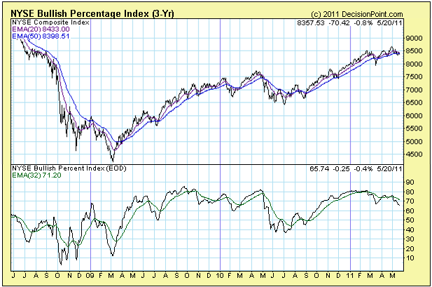
(Chart courtesy of DecisionPoint.com)
The BPI measures the percentage of stocks in an index on point and figure buy signals. The theory is that a high reading (over 70) following by a decline of more than 6 is a bearish warning for the market. It has not really worked that well during the Fed-goosed rally but there is something here that caught my eye. I see a rather significant divergence between price and indicator.
Does this matter? With a limited set of history on this chart it did seem to say something at the minor 2008 low and the major 2009 low. Let's add this to the bearish side of the ledger as a" maybe."
2 comments:
Here is another tick for the bear camp:
There is butterfly terminal pattern very clearly to be seen on the Dow & its at the trigger point for entry. (Larry Pasavento came up with the pattern).
Some of the fib ratio's of the butterfly I mentioned are not perfect but close. So pls dont flame me.
I am talking about the following ratios:
AB=CD (Cd is slightly trucated)
BC=.618AB (close)
CD=1.618AB
Post a Comment